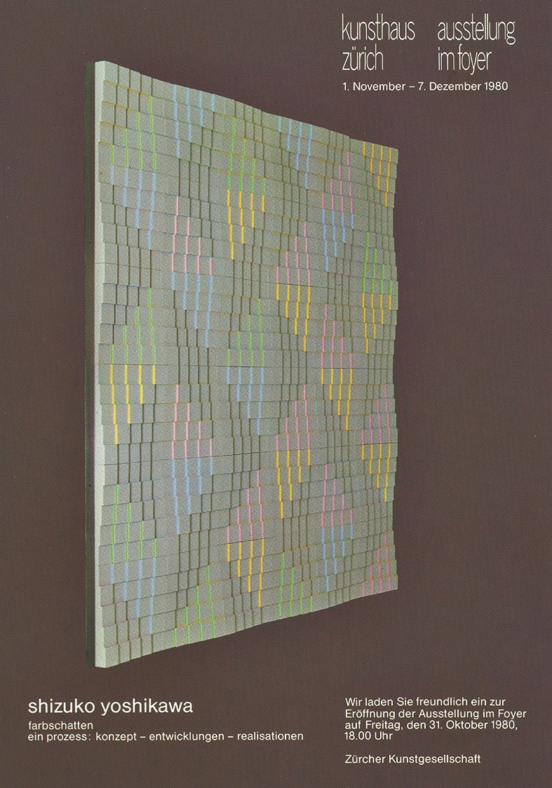
SHIZUKO YOSHIKAWA, 08/01/1934–27/03/2019
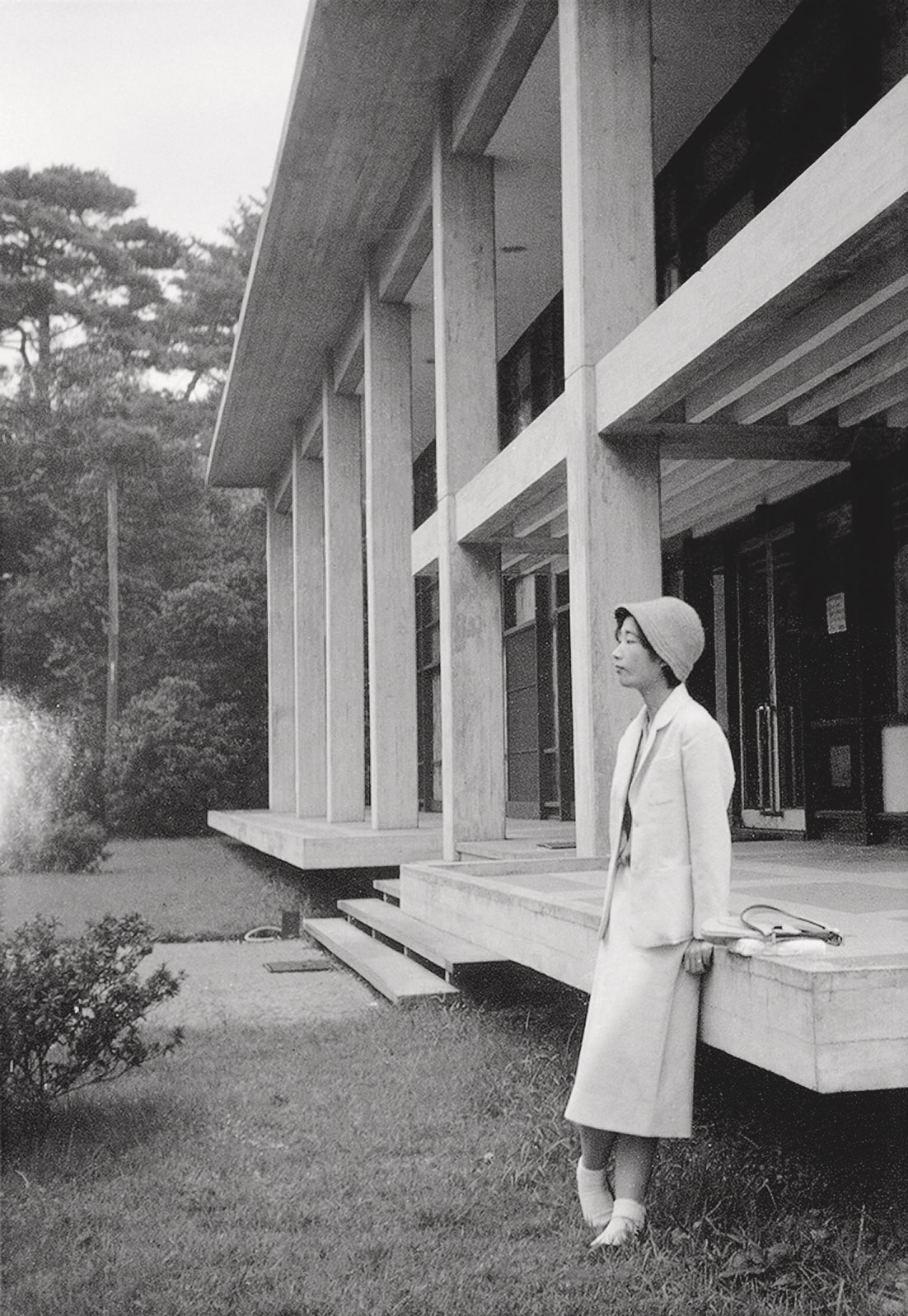
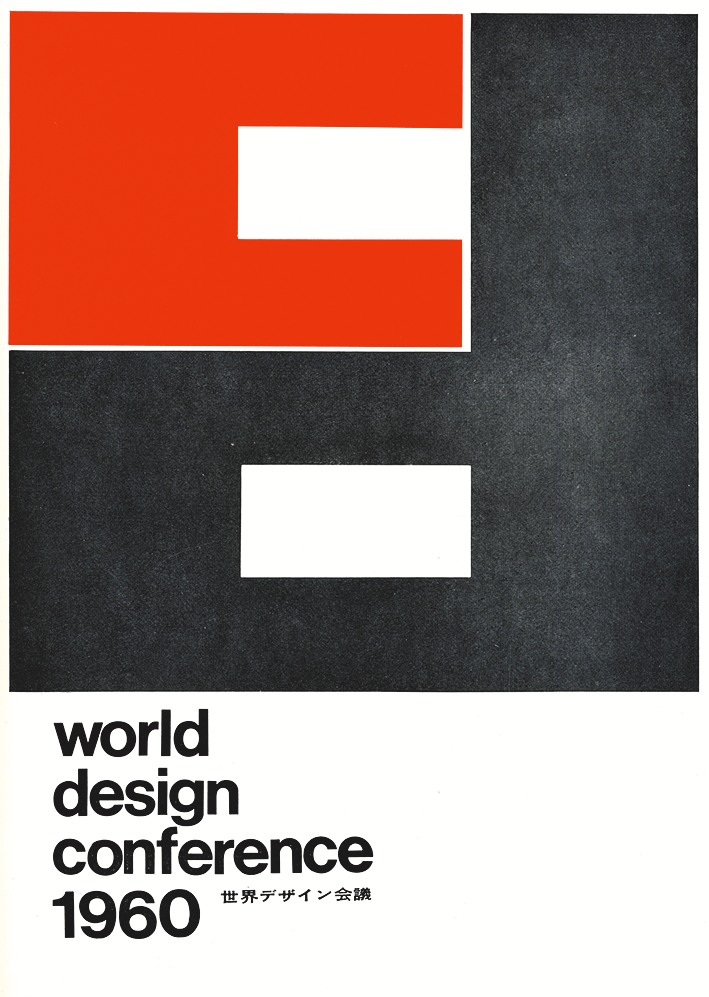
The artist began her career after completing a BA in English Language and Literature at Tsudajuku College (now Tsuda University) in Tokyo after World War II. In 1958, she was admitted to a master’s program in architecture and product design at Kyōiku University (now Tsukuba University) in Tokyo. After participating in the organizing team for the World Design Conference (WoDeCo, 1960) in Tokyo as a coordinator and interpreter, she left for Ulm in 1961. At the Hochschule für Gestaltung Ulm (Ulm School of Design), she was one of the few Japanese students to study in the visual communication department, where she inter alia contributed to Otl Aicher’s corporate design for the German airline Lufthansa. Her teachers also included Horst Rittel and Friedrich Vordemberge-Gildewart, as well as Josef Müller-Brockmann. In Ulm she sometimes felt that she was viewed with an exoticizing gaze as a Japanese student, yet felt she would have no future as a graphic designer in Japan’s hierarchical design world. In 1963 Yoshikawa therefore moved to Zurich, where she took a job in the studio of her future husband, Swiss designer Josef Müller-Brockmann. There she worked with Gudrun von Tevenar, who had likewise studied in Ulm, as chief designer for the Education, Science, Research pavilion at the 1964 Swiss National Exhibition (Expo 1964) in Lausanne. Alongside her career as an award-winning poster designer and graphic artist in Zurich, she gradually turned to the fine arts after marrying Müller-Brockmann in 1967. A Kunst am Bau (Art in Architecture) project commissioned for the parish of Zurich-Höngg (1972–1974) marked the launch of her artistic career. Through Yoshikawa’s involvement in the gallery showcasing Concrete Art galerie 58 (1965–1974)/galerie seestrasse (1974–1990), which her husband had run since the mid-1960s in his hometown of Rapperswil (SG), she became familiar with and developed an appreciation for key figures from the first generation of Zurich’s Concrete Art movement, such as Max Bill, Camille Graeser, Verena Loewensberg and Richard Paul Lohse. Building on their Constructivist/Concrete principles with her sensitivity for color and light design, Yoshikawa opened up new, undogmatic trajectories for this purportedly “cold art.” In recognition of her artistic achievements, Yoshikawa was twice awarded an art scholarship by the Canton of Zurich (1974, 1977) and received the Camille Graeser Prize in 1992.
In addition to conceptual sketches, drawings, and gouaches created between 1972 and 1992, at an early stage in her career Yoshikawa began developing large-scale sculptural-environmental art in architectural pieces and works in public space. These combine rigid geometric logic with an awareness of materials such as concrete. In each case, Yoshikawa’s playful approach factored in the ephemeral, transformative environmental aspects of the immediate surroundings. In the field of relief art, Yoshikawa developed a body of works that is among her most important, the Farbschattenreliefs (Color Shadow Reliefs), in polyester and epoxy resin, made in various formats between 1976 and 1984. A successful exhibition at the renowned Minami Gallery in Tokyo in 1978 served as a springboard for her success in Japan, Switzerland and elsewhere, with numerous follow-up exhibitions. Through her relief works, Yoshikawa discovered a pastel color palette that became influential in her early period, while also discovering a route into Concrete painting, a practice she pursued consistently until a few years before her death. Beginning in the 1980s, the artist developed several extensive series of paintings in this vein, underpinned, for example by the principle of modular units, but also in the form of nuanced, multi-dimensional grid structure paintings based on symmetrical axes or polyphonic configurations comprising color cross-sections of seemingly closely positioned elements in the unusual format of tondo-shaped canvases. Over the years, her compositions became increasingly dynamic, daring to break the rules of rationalism. Her conceptual and intellectual insights bridge perceptual and representational traditions in East and West. The mix of theory and sensibility in Yoshikawa’s practice brought her numerous invitations as a guest lecturer: inter alia, within the framework of an IBM fellowship at the Aspen Institute for Humanistic Studies, at Kyōiku University, Kyoto, at State University, New York, the National University of Colombia, Bogotá, and the University of Arizona, Tucson. In 1996, an extensive solo exhibition at the Contemporary Sculpture Center in Tokyo honored her tenacious practice in various media. After a period of withdrawal, Yoshikawa made her comeback to Japan in 2018 with an exhibition at AXIS Space Tokyo.
A Selection of Public Collections with Works by Yoshikawa:
Kunstmuseum Bern; Kunstmuseum Luzern; Kunsthaus Zürich; Haus Konstruktiv Zürich; Zürcher Kantonalbank; Landeszentralbank Düsseldorf-Neuss; Museum für Konkrete Kunst Ingolstadt; Wilhelm-Hack Museum, Ludwigshafen; Staatsgalerie Stuttgart; Museum Ritter, Waldenbuch; The National Museum of Modern Art, Osaka; The National Museum of Modern Art, Tokyo.
Links:
Eintrag Künstler_innen-Lexikon der Schweiz SIKART
Bibliographie (SIKART Lexikon)
Kleio-Datenbank

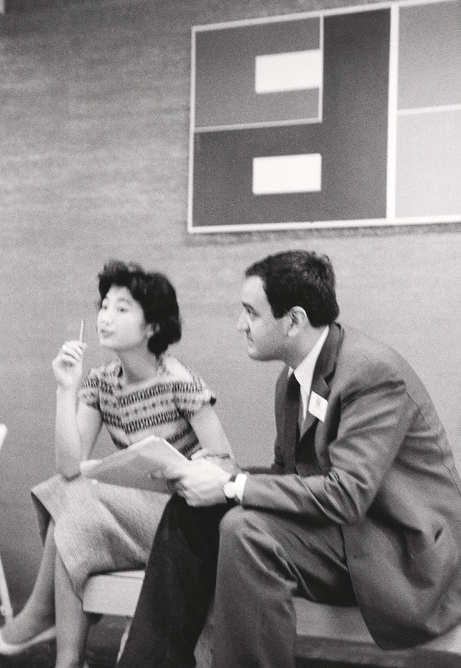
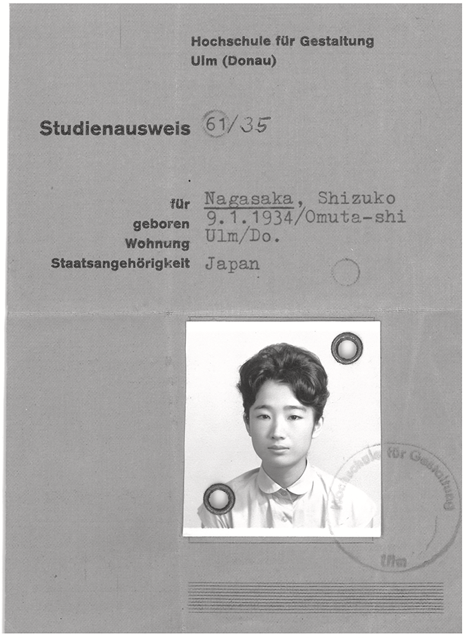
SY interpreting at the World Design Conference (WoDeCo) with Tomas Maldonado, Tokyo, 1960 Student card from Ulm School of Design, Shizuko Nagasaka (surname of her first husband)


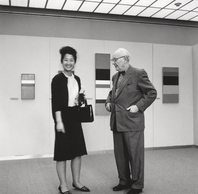
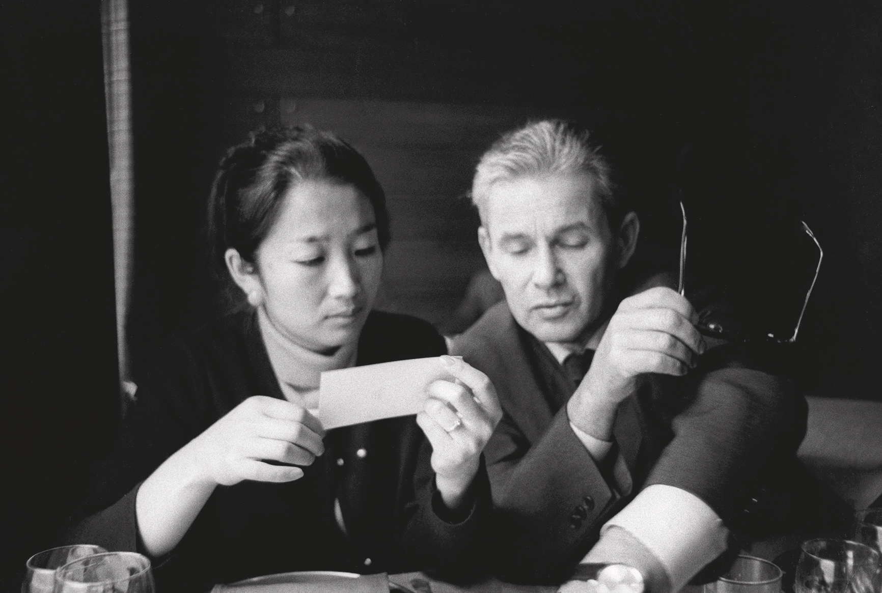
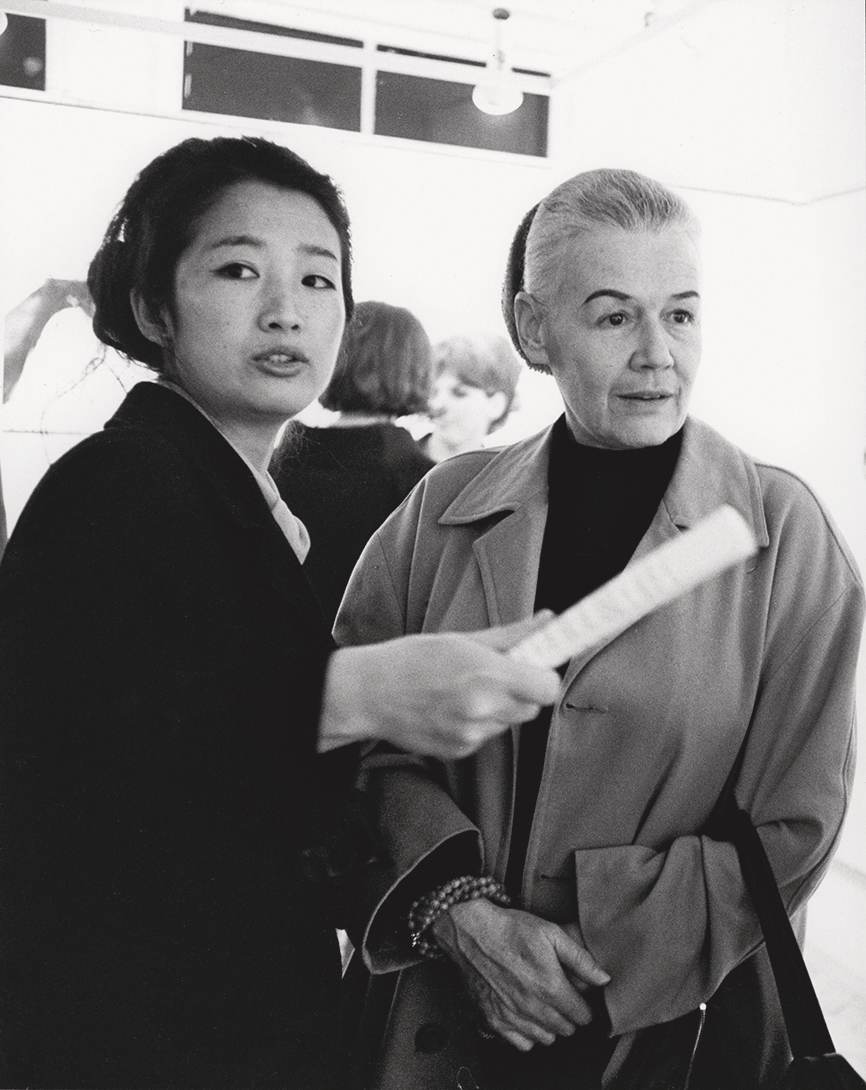
SY with Camille Graeser, Kunsthaus Zürich, 1962 SY with JMB, ca. 1965 SY with Verena Loewensberg on the occasion of an opening, 1960s


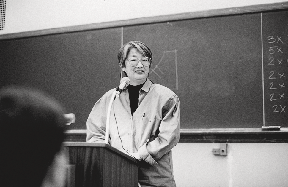
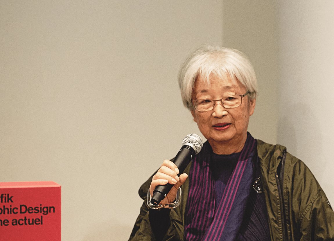
SY, lecturing activity, 1976 SY, lecturing activity, 2014


ART AND ARCHITECTURE
Shizuko Yoshikawa found her way into painting through art developed specifically for an architectural setting. How are spatial experience and perception manifested in an interplay with architecture? The artist tackled this question in commissioned works or experimental projects with a conceptual focus developed with architect friends. In this context, she understood spatial experience as a consequence of giving concrete expression to abstract-mathematical relationships, rooted in the psychology of perception. In particular, the way in which she incorporated light, shadow, water or plants as environmental factors and temporal indicators links in to the harmony between diverse, sometimes contradictory elements that Yoshikawa subsequently explored in parallel in her painting. Throughout her career, she submitted entries to Kunst am Bau (Art in Architecture) projects. The works she realized in this context include Zurich-Höngg, Katholisches Gemeindezentrum (Catholic Community Center), vier mögliche progressionen (four possible progressions), 1972–1973, wall relief; Zurich, Universität Irchel (Irchel University), Farbschatten Nr. 108 (Color Shadow No. 108), 1980, polyester relief; Zurich, Witikon Municipal Nursing Home, wasser-relief landschaft (water-relief landscape),1981–1983; Zurich, University Hospital, Eye and Ear Clinic, fliessende farbräume (flowing color spaces),1988–1992, interior design; Zurich, Schulthess Clinic, lobby, yin-yang kegel (yin-yang cone),1992–1995; Yokohama, Internation Stadium, Farbschatten Nr. 108 (Color Shadow No. 190),1997.
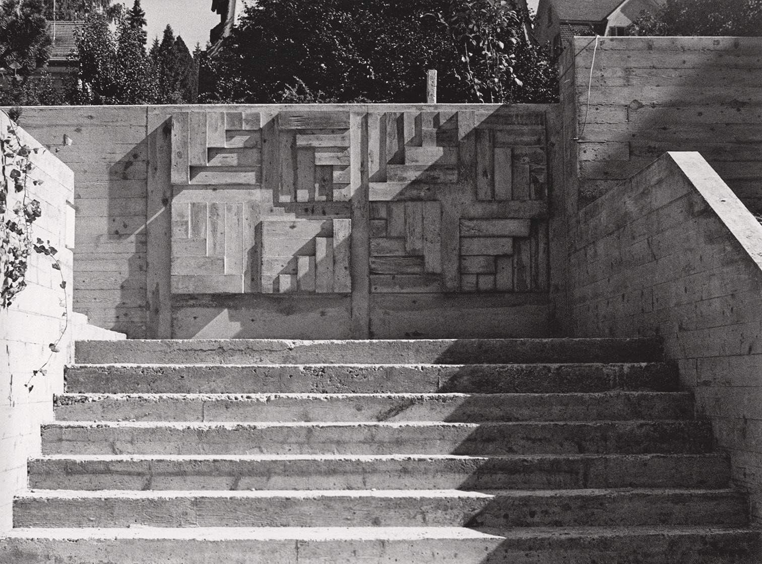
The works four possible progressions (outer wall and inner courtyard) and negativ und positiv (negative and positive) (entrance stairs to the church) are based on four square or nearly square wall relief fields structured along diagonal axes. Using minimal mathematical means, Yoshikawa achieves maximum perceptual impact through the descending and ascending mass of a fixed basic unit. In this project, the basic unit is standardized and a logical consequence of construction, as it is derived from the wooden formwork elements that were used in construction of this concrete church. The basic units, perceived as tapering triangular forms or divided into squares, are juxtaposed in ascending or descending sequence, while also being extended or shortened as required to ensure regular division of the surface. The perception of shape is multiplied. In addition to rotational figures, the concrete, with its wood-structured graining, asserts a raw materiality. Light striking the consistently transformed surfaces picks out the graphic lines of the relief, while also casting shadows on the floor and wall. As a result, the relief and the play of the daylight conjure up a sequence of ephemeral/constant figures that are projected as shadows in the seemingly static work. At the time, this work Yoshikawa had been commissioned to create met with a positive response in the Zurich daily press. Six years later, Willy Rotzler still judged the relief a successful example of sculpture that does justice to the material, because “the most valid solutions […] were found in which there was a will to allow the material and its technology to speak as well, in disciplined restraint […].”
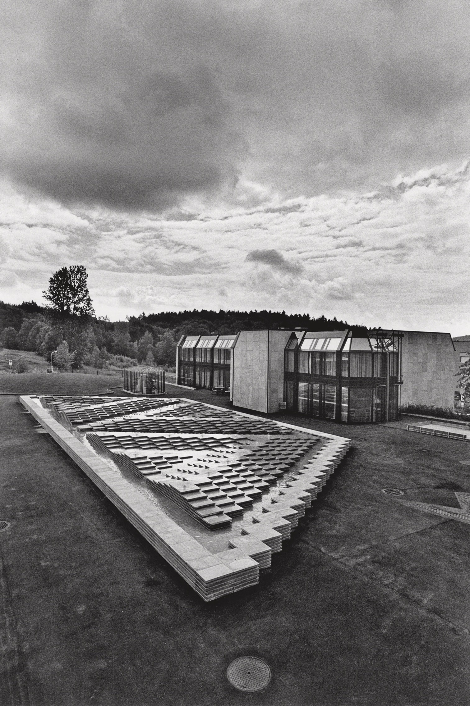
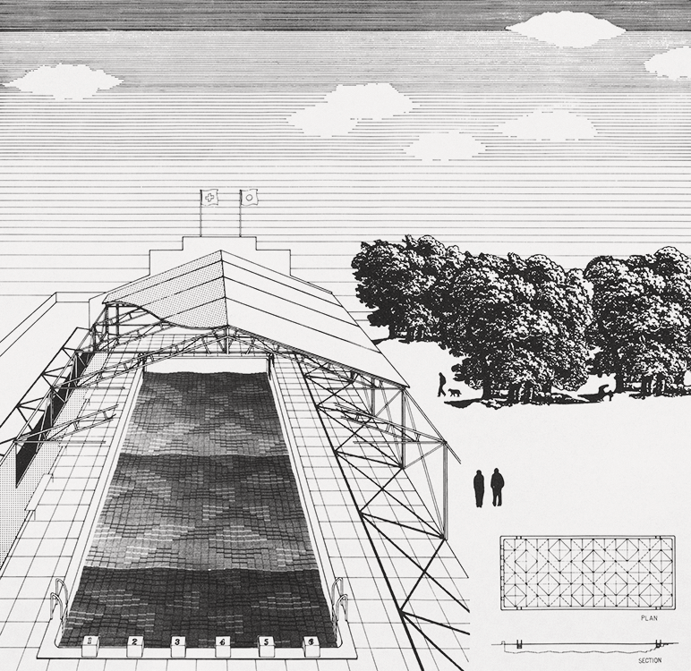
In the controversial piazza design of the water-relief landscape (1981–1983, no longer extant) at Witikon Municipal Nursing Home in Zurich, she also worked with concrete assembled into a relief. Around ten years after her first successful project implementation, on this occasion her large-scale relief was set in the floor of the outdoor area adjacent to a nursing home café. In collaboration with Zurich architect Frank Krayenbühl, Yoshikawa took a trapezoidal form and a raised plinth zone as the basis for the floor design, which is made up of 1,400 uniform rectangular, industrially manufactured concrete slabs. She layered the basic unit of the concrete slab above these elements, distributing the whole work across three zones in the form of isosceles triangles, set in alternating orientation. The three terraced hills or islands thus created were supplied with artificial sources of water. On the one hand, Yoshikawa envisaged that the water would flow calmly from the tips of the islands, across the rectangular slabs and into the pond, with its fragmentary reflections of the surroundings. On the other hand, the artist once again included time-based changes as an integral component of her work. The lush proliferation of algae and moss gradually growing on the concrete base was intended, in the best-case scenario, to complement and defamiliarize human design within the water feature: “The moss will organically robe the strict geometric form of the relief landscape. It must be considered a factor that creates beauty and cared for accordingly.” In this case, however, this component included in Yoshikawa’s design proved truly unpredictable. Contrary to Yoshikawa’s intentions, the relief landscape was regularly cleared of moss. That thwarted a more tangible manifestation of the piece’s quintessence, the tension-driven relationship between two superimposed structures. With hindsight it is clear that the only tension-driven relationship that emerged was that between different cultures, with differing perceptions and appreciation of moss as an integral element and aesthetic component within the work.
This water-landscape-relief realized in Witikon for the City of Zurich, a public-sector client, should be considered in particular in connection with Yoshikawa’s earlier project proposals for the VI Biennale d’Arte Contemporanea San Martino di Lupari, Padova, 1981. Responding to the motto adopted for that exhibition, “Arte e architettura, poli di ricerca geometrica” (Art and Architecture, Poles of Geometrical Exploration), the artist presented two collaborative projects: the first involved model and plans for a house and garden designed as a Gesamtkunstwerk in collaboration with Zurich-based architect Karl Fleig, who had studied with Alvar Aalto. The second proposal was for a public swimming pool, designed to be partly open-air; it was depicted as a color photo collage on black-and-white photo paper and developed with Tokyo architect Yuzuru Tominaga. Concerning the proposal she drew up for a detached house with garden, grounded in multiple interlocking square areas and a grid structure, she stated in 1981: “Especially now, […] when our civilization and living space are becoming more and more technocratic, it is important for art to acquire a new meaning and to provide vital content for the human spirit. To be successful, such a social and cultural project […] must naturally be sought and defined collectively and collaboratively.”


COMMERCIAL ART | APPLIED ART
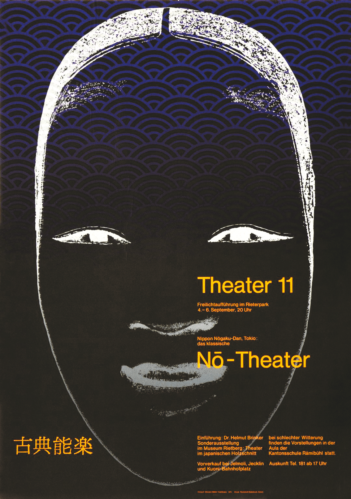
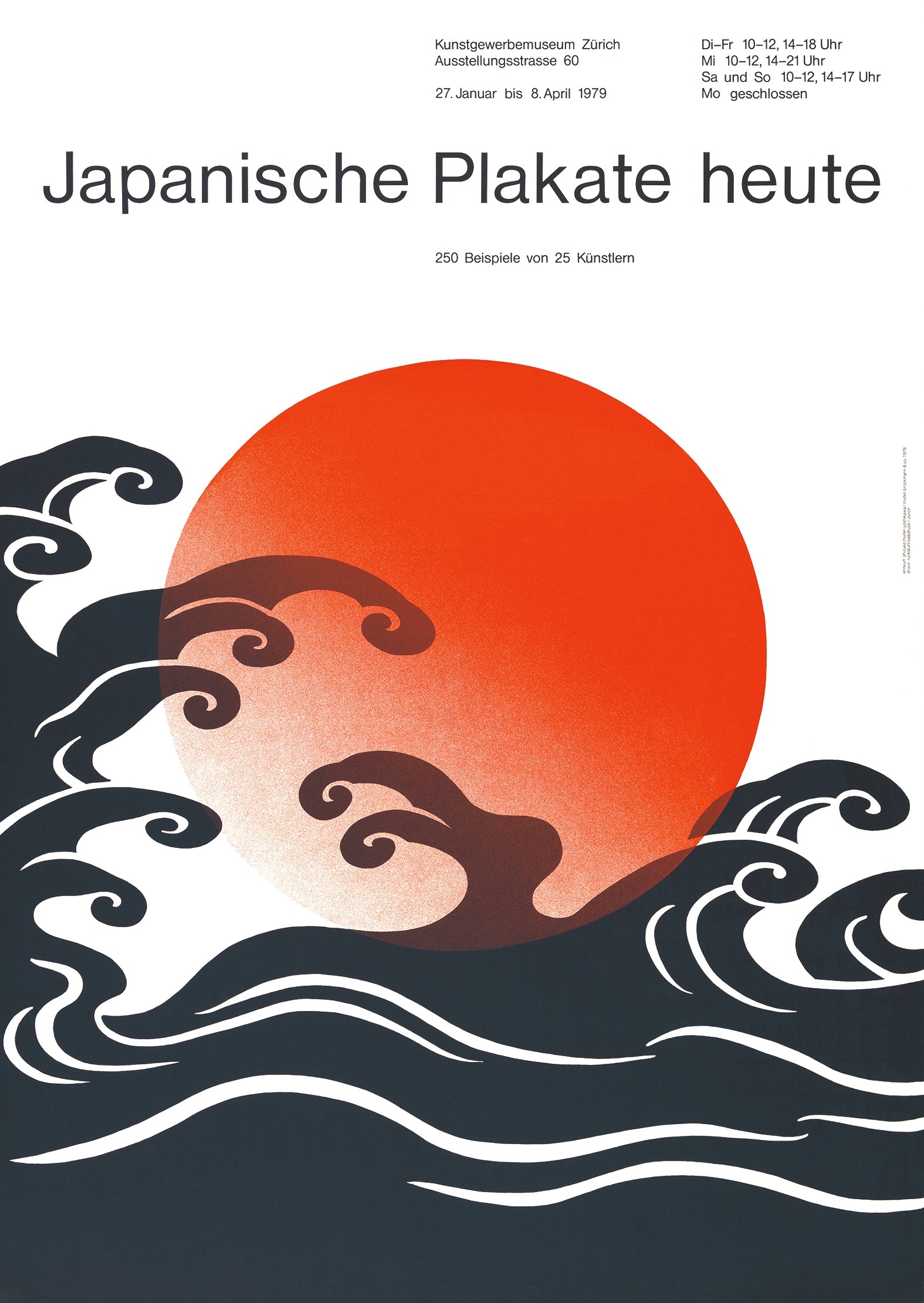
As a graduate of the Ulm School of Design’s Visual Communication course, from 1963 Yoshikawa worked in the office of her future husband Josef Müller-Brockmann. As a freelance graphic designer between 1968 and 1978, she developed her own illustrious client base, as well as winning awards for her poster designs, such as for Nō-Theater (Swiss Poster of the Year 1975). In this context, over and above Yoshikawa’s affinity for cultural institutions as clients, her preference for themes linked to Japanese culture also became apparent. She combined their aesthetics with precise Swiss poster design. The applied arts brought Yoshikawa together with one of the world’s most successful graphic designers, her former mentor Müller-Brockmann, uniting them in a life-long personal partnership as well as on an aesthetic level. This is demonstrated, inter alia, by the poster designs for their joint exhibitions. Although Yoshikawa had devoted her attention almost exclusively to the fine arts, specifically painting, since the 1980s, one of her last poster designs for an exhibition at Museum Rietberg in Zurich, presenting netsuke handcrafted in the form of animals, dates from 1987.
SY, Nô-Theater, poster, Theater 11, Zurich, 1974 SY, Japanische Plakate heute, poster, Kunstgewerbemuseum, Zurich, 1978


WORKS ON PAPER
Parallel to the body of painting that developed via her relief pieces, Yoshikawa worked with gouaches and pencil on paper. These compositions often mirror the exploratory process manifested in her painting, while nevertheless constituting a distinct aesthetic branch of her oeuvre. Yoshikawa’s works on paper are consistently numbered, although they do not bear the kind of titles for groups of works that the artist gave to her painting series.
The drawings are furthermore complemented by a series of prints that reproduce motifs from either the gouaches or the paintings. Within the corpus of around 100 editions, some works on paper stand out in particular. The depiction of four gridded cubes set across from each other, which Yoshikawa designed as an insert for Ilma Rakusa’s slim volume Leben (Life), is made up of white and black lines on brown paper. The artist was on friendly terms with the Slavic Studies scholar and author. Despite the title d52 innen und aussen (d52 interior and exterior) (not dated), Yoshikawa’s screen-print edition in a print run of 25 has strong echoes of the formal and aesthetic principles of the Kunst am Bau work in granite and marble mentioned above that was designed for the main entrance at the Central Bank of North-Rhine Westphalia, the Landeszentralbank, in Neuss near Düsseldorf: wandrelief: nicht zweiheit (wall relief: non-duality) (1987–1988). In that work, however, groups of four and six stereometric gridded cubes seem to mesh together on one wall, projecting a multitude of new sections, forms, and spaces across the wall surface.

RELIEFS | PAINTING
COLOR SHADOW RELIEFS
Beginning in 1974, Yoshikawa used smaller-scale reliefs as a format to give material expression to a sequence of states by means of potential dependencies in visually variable colored light mosaics. The medium-format relief series created between 1974 and 1976, sequenzen (sequences), progression II and transformation von vier gleichen farbflächen (transformation of four identical colored surfaces), still deployed specially constructed wood and Plexiglas topological cell structures, painted in various colors with acrylic paint. In parallel, she also projected her three-dimensional examination of the color-form effect onto flat surfaces using screen-printing techniques, as evidenced by the graphic series of the same name and the work on paper metamorphose (metamorphosis) (1974–1976). At the same time, she also worked with acrylic on canvas for the first time to create t1-t6 transformation offour equal-sized colored surfaces I-V intothe medium of painting. These seemingly self-contained works that are nonetheless interlinked across various artistic media have a particularly striking color palette. In turquoise blue and ochre green, in pink, orange, green, and violet, Yoshikawa experimented here with an idiosyncratic, sometimes awkward-looking scale of color hues. Two years later, after exhibiting her work for the first time at galerie seestrasse in Rapperswil (1974) and in the Music Hall at Osaka Art Center (1975), she discovered the central focus of interest that would inform her practice in subsequent years when reading Eckart Heimendahl’s 1961 physical study “Licht und Farbe” (Light and Color), Yoshikawa’s color shadow reliefs, which are grounded in this intensive study, are based on the following principles: Opposing lateral surfaces of a square in relief that emerges from the plane are painted using differing complementary-contrasting pigments that are rendered a lighter hue by the addition of white. The upper surfaces of the mini-cubes that become visible as a grid pattern are left white, although incident light from the side has an impact on them, generating iridescent color reflections and patterns. Once again, the artist achieves maximum luminosity and ambiguous shape perception with seemingly minimal means. At the same time, Yoshikawa noted that painting the lateral surfaces with great precision is hugely time-consuming, as is determining the exact complementary contrasts in lacquer and acrylic on the polyester and epoxy resin models made off-site.
The overarching pictorial relief form, which can be identified as a light grid pattern, is grounded in various “types.” These are arrangements made up of 2 × 2, 2 × 3 and 3 × 3 elements, each 5 × 5 centimeters. These elements are prefabricated polyester units, each with a 5-millimeter height offset. In her pictorial relief conceptions, Yoshikawa played with these “types” by rotating them, inverting them as mirror images, or transposing them into a perpetual motion to generate topological crystalline surfaces. As she explained, “As a result, two complementary color pairs face each other around the diagonal axis in the color wheel order, and two adjacent colors likewise intersect on a topological surface.” Drawing on this, the artist derives an autonomous law of color organization in a light and color space.


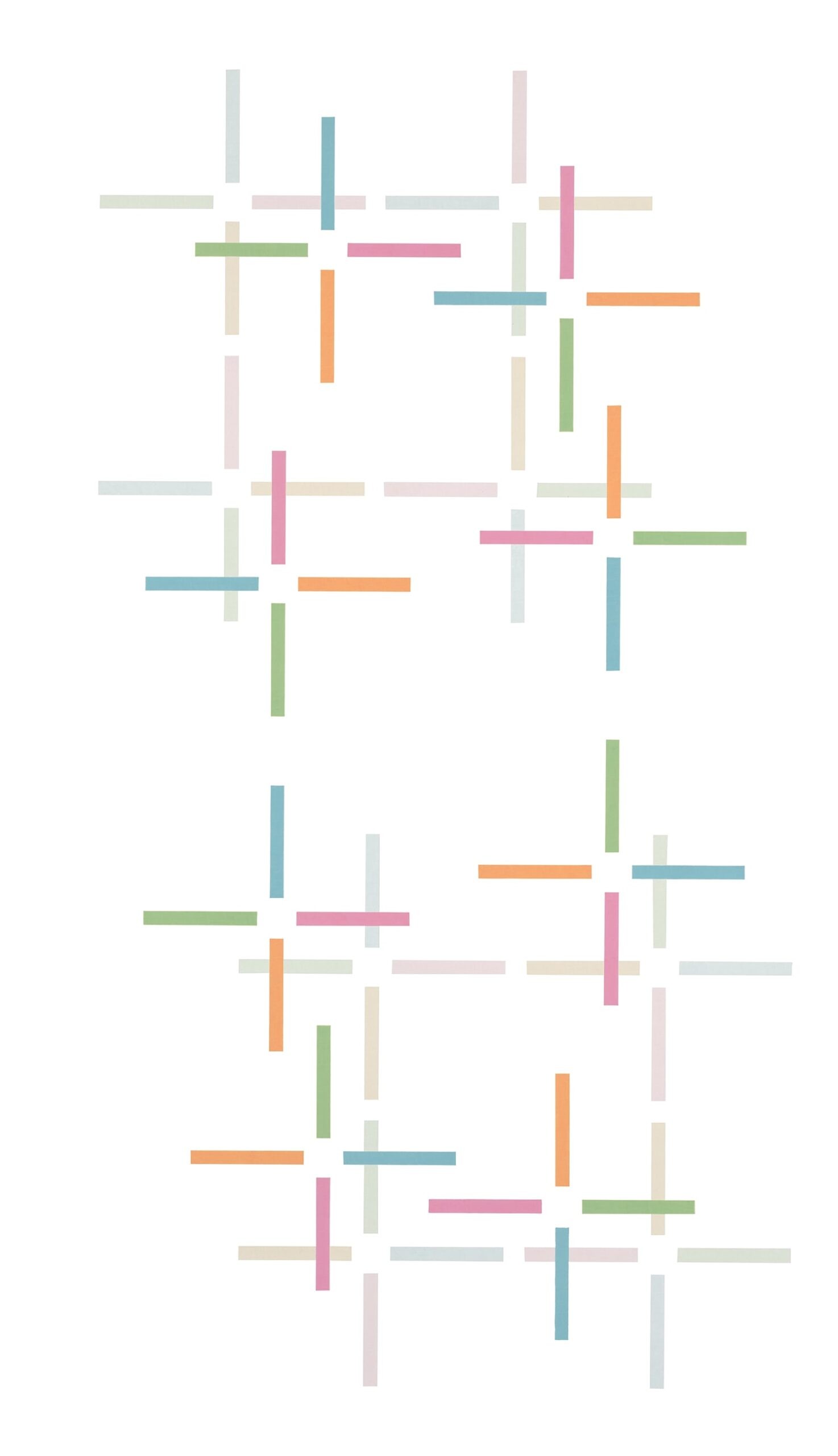
NETWORK STRUCTURE IMAGES
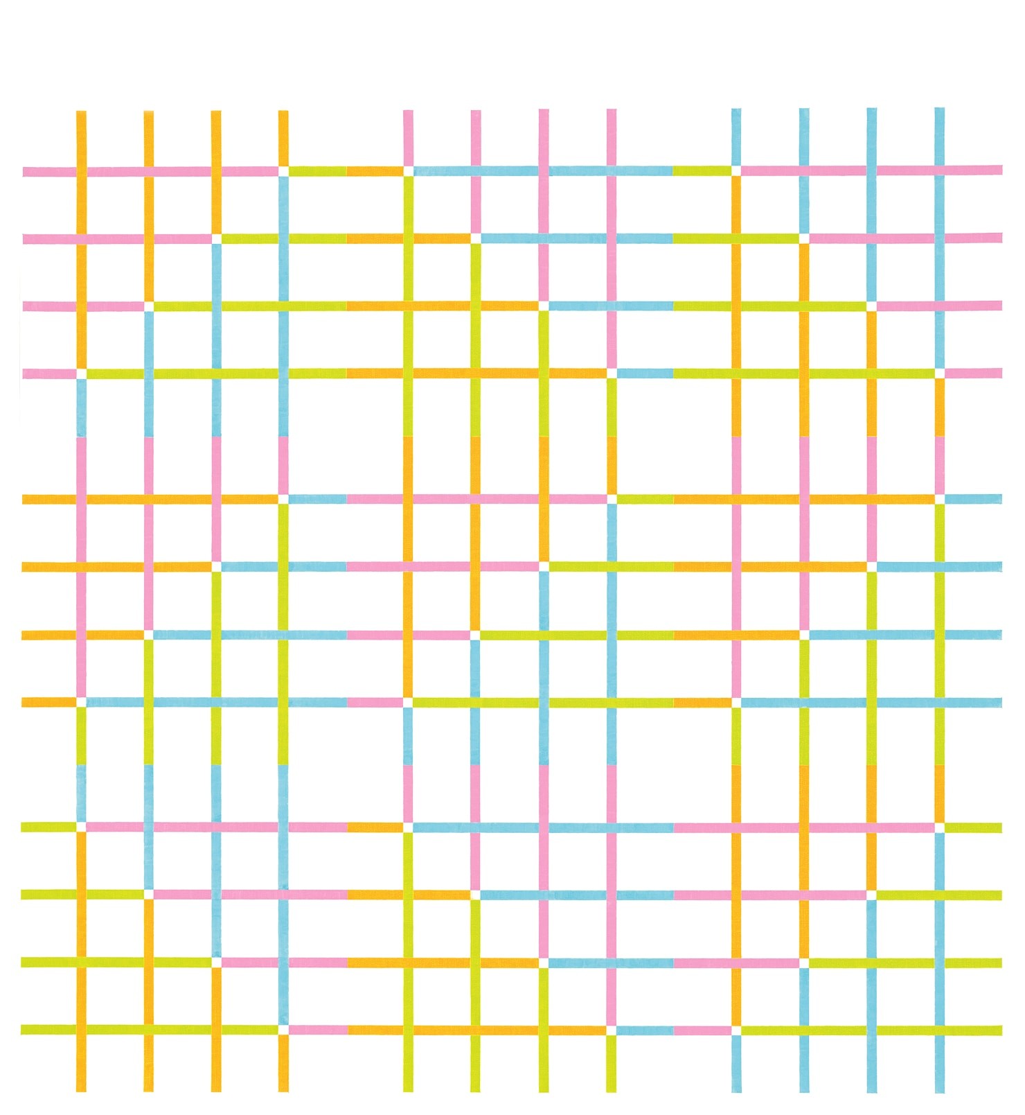
Between 1976 and 1986, parallel to the color shadow reliefs, she created grid projections – also referred to as “network structure images” – initially in tempera and acrylic paint on paper, subsequently in acrylic paint on canvas: “The synthesis of immaterial and material color that I attempted to depict in the reliefs signified a new autonomous task in my painterly practice,” Yoshikawa noted of her painting. Using an increasingly broad and nuanced pastel palette, her grid works in complementary contrasting hues, mostly organized along diagonal (mirror) axes, do not simply introduce structure into the flat surfaces (m1-m200). Thanks to serial variations within the color wheel, the artist transformed the static canvas into an elementary, structured, seemingly mobile plane, creating a vibrating topological surface though the optical mix of harmonious color transitions and interstices. Echoing her reliefs, Yoshikawa ran through various iterations, combining “types” in similar basic patterns. In this context, her painting initially focused exclusively on square medium-format canvases.
She introduced a rotational component into her painting inter alia by inserting her canvases into the boundaries defined by the parallel walls within the architectural frame of the studio, surrounding space or exhibition room, seeking in a sense to ascribe a new format to them. In works that subvert the tautology between a square basic form and a square canvas by deploying means including paradoxical color effects within the consistently square formal principle, Yoshikawa interlaced rotated reflections, translation and transformation in landscape and, more rarely, portrait formats. The canvases’ dimensions played an increasingly important role. Later, she often adapted the mass of her works to specific settings – revealing her credentials as a 1960s designer trained to respond to and influence conditions in the surrounding environment.

HOMMAGE AUX UPANISAD
After 1989, having experimented with various methods, the series hommage aux upanisad 1–32 (homage to the upanishad)(1989–1990) with its philosophical underpinnings, offered Yoshikawa a viable formula to move further away from the grid and even closer to the universal notion of the network that structures all her works in a host of different ways. In this series she often overlaid the white of the blank ground, which is so important as an integrative element of her art, with coats of translucent primer. Through this stratification process, she established a relationship between the individual elements, while also setting up dependences between various pictorial planes with a spatial impact as layers of transparent glaze. The individual elements, in many cases also rotated, form figures that seem to have been detached from the earlier pervasive grid. The individual elements combine to form rhythmic agglomerations as well as repetitive intervals, in the process opening up reciprocal echo chambers that permeate the various levels. Yoshikawa’s allusion to the “Upanisads,” frequently also spelt as “Upanishads”, references a collection of philosophical writings from the 1st millennium BC that articulate the basic tenets of Hinduism. Yoshikawa thus paid tribute to an Eastern textual corpus, although it does not form part of a Buddhist or Japanese essentialist tradition. The term used to designate the Hindu scriptures could be translated literally as “sitting down close to.” That could also reference a secret, instructional session at a teacher’s feet. A call for introspection forms the quintessence of the text, which is composed of many fragments. Only a person who learns to know himself or herself can become what he or she identifies with, for our thoughts and actions determine our personal karma.

TWO ENERGIES AND COSMIC WEBS
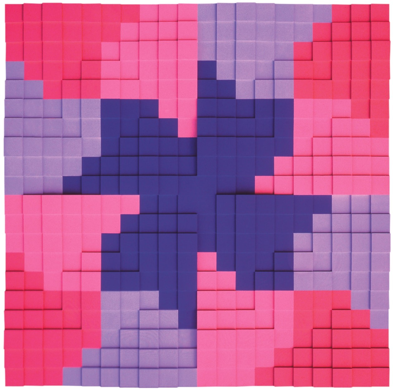
In Yoshikawa’s artistic work, the early 1990s were shaped by the realization of four parallel exploratory series. These began with the groups zwei energien 1–38b (two energies 1–38b)(1990–1991) or zwei energien – diagonal 1–35B (two energies diagonal 1–35B)(1990–1992) and energien aus der leere 1–64 (energies from the void 1–64)(1990–1994). In the former group, she returned to the square canvas, developing zwei energien 1–23 as small, medium, or large-format (100 × 100 cm) variations on a theme. The series pick up on elements from the late 1980s series, combining them with principles since explored in a new vein. In these non-representational pictorial fields, Yoshikawa’s explorations focused, as it were, on energy striving outward and energy gathering in the center of the pictorial field. Simple observation resonates with Vordemberge-Gildewart’s principles for painting. As if “zooming in,” Yoshikawa appears to enlarge sections from earlier series. Consequently, she conjures up a force pulling toward the square in the middle, its center forming and simultaneously disintegrating. Further heightening the complexity, she used tempera and acrylic on canvas. Even though Yoshikawa never mentioned this aspect, in contrast to her allusions to other points of reference, the pictorial structure here, particularly against the backdrop of Yoshikawa’s earlier grid paintings, involuntarily recalls esoteric Buddhist mandalas from the Japanese Shingon school. The square-structured mandalas symbolize the universe in which all living beings are united harmoniously. This comparison serves as a foil, highlighting the traits of two energies 1–23 all the more clearly by underscoring the differences too. In this period of her oeuvre, Yoshikawa seeks to visualize a precarious state through the rhythm with which the paint has been applied to the canvas: the ephemeral moment in which two conflicting energies are in balance before one or the other gains the upper hand, tipping the taut equilibrium out of kilter. The square canvases of the second, 35-part energies series, painted around the same period, raise the question of role models. In the light of the empty center of the images, Verena Loewensberg springs to mind, Yoshikawa’s renowned forerunner in the field of Concrete Art.
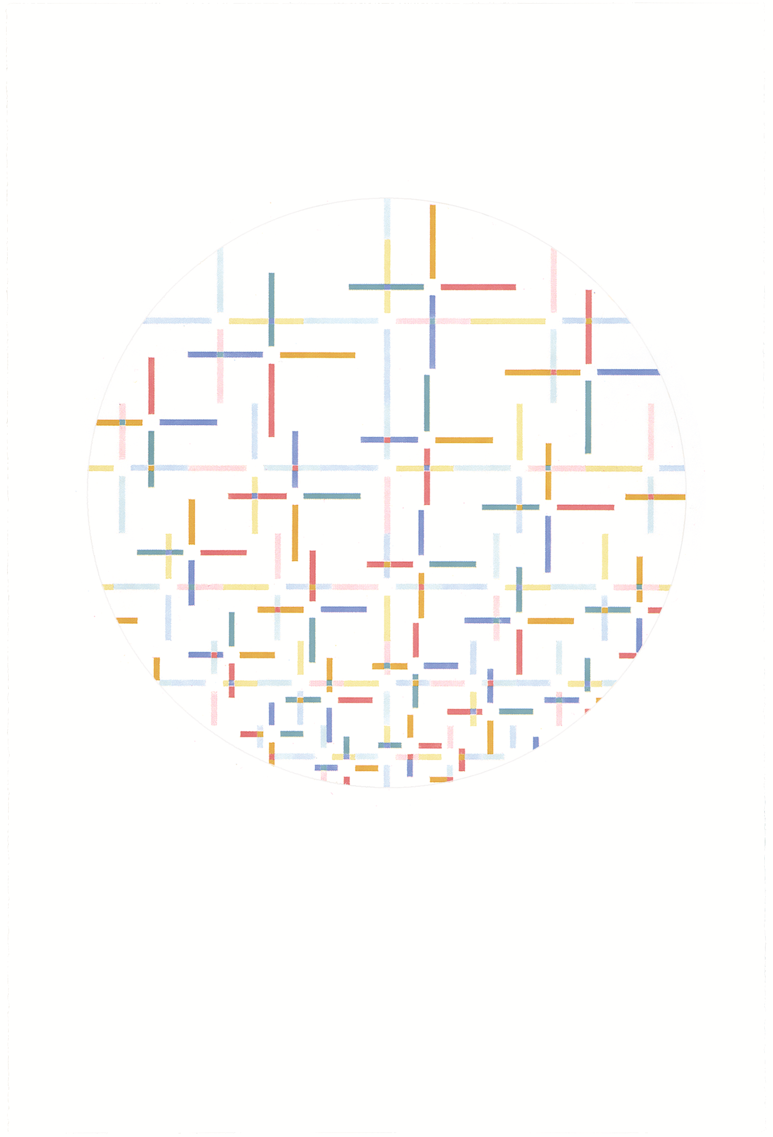
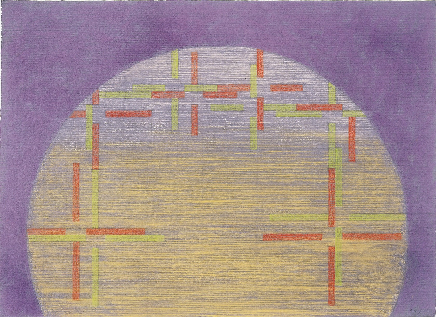
In1991 Yoshikawa began a fourth series, partly realized in parallel, cosmic webs. As a thematic strand, the “cosmic web,” however, remained among Yoshikawa’s concerns over a longer timeframe of roughly ten years. She nonetheless tackled it differently in each individual section of her oeuvre. Within the myriad series she developed, she investigated a range of differing phenomena or explored distinct manifestations of the same phenomenon. From 1990 to 1992, she continued to take the square as a starting point. In these pieces, however, the square stands on one of its sides rather than being tilted to balance on the tip of a right-angle corner. Small truncated crosses in a host of colors and with arms of varying lengths emerge on the margins of the image, their dimensions slowly diminishing, and, rather than defining a square shape in the middle of the pictorial field, instead conjure up a round form that seems “pixelated” at the edges.
Yoshikawa subsequently turned this pictorial effect on its head. In an exceptional yet entirely logical development, this led her to engage with a pictorial format completely new to her practice: the tondo. It offered the artist a fundamental form that once again evokes the tensions between different cultures that become apparent in her oeuvre. First of all, however, let us consider this primal form from the vantage point of Constructivist-Concrete tradition. The tondo also features in the work of Fritz Glarner (1899–1972), albeit in an entirely different vein as a pictorial support or theme. Quite apart from the fact that Yoshikawa never painted with primary colors, or in gray, black and white, she was not principally interested in the relationship between color values in working with the tondo format. In this phase of her oeuvre, Yoshikawa was much more concerned with “radiant” harmony. The cosmic dimension comes to the fore in this web like a chord teased out into a melody, growing out of the rhythmic distribution across the pictorial surface of cross shapes on multiple planes, reinforced by the tension between the fundamental principle of orthogonal, angular components and rounded, circular elements.


A Roma
The series a roma marks a caesura and a turning point in Yoshikawa’s life and work. She had never previously diverged to such an extent from Concrete Art’s classical vocabulary. The pastel chalk drawings and gouaches, sometimes on colored handmade paper, that she made from 1997 to 1999 reflect the Mediterranean environment Yoshikawa experienced during her repeated stays in the studio of the Istituto Svizzero di Roma. From year to year, Yoshikawa’s thematic exploration of the sinking sun and pairs of crosses wedged together or drifting apart grew more balanced and lighter. Yoshikawa selected the sun as the starting point for this thematic series, deliberately breaking with Concrete Art’s non-figurative orientation. Worked in chalk, the rough-hatched or brightly clouded backgrounds display texture previously not found Yoshikawa’s paintings and drawings. In Rome, the artist worked through her grief over the death of her husband Josef Müller-Brockmann (1996). In this cyclical process of detachment, she looked back to her roots in Japan and ahead to potential new approaches for her artistic work.


My Silkroad
The theme of roaming formed the new principal focus in Yoshikawa’s creative work from 1998, again, impressively, for a whole decade. The series my silkroad (1998–2011) owes a great deal to the artist’s experiences with cosmic webs and to the sunshine and moonlight in the wintery heavens above Rome, as reflected in a roma. At the same time the evocative title, like the earlier hommage aux upanisad, was also a deliberately articulated poetic reference to the Far East. It was not only silk and other wares that travelled with traders from East to West along the Silk Road, an ancient network of caravan routes linking the Mediterranean to eastern Asia over land via Central Asia: armies and scholars took this route too. Yoshikawa made the Silk Road into her way back to Japan. While in earlier years she had also travelled to the Middle East, marveling at the night skies over the desert or sailing through the Suez Canal on her way to Ulm, she now in spirit journeyed “back” in the opposite direction by land and by water. The canvases, initially in portrait and later in large-scale extended landscape format, have intensive-colored grounds, with a luminescence stemming from the many superimposed homogenized layers. At the same time, they thus transport the turquoise and Samarkand blue tones without creating a sense of representation or abstraction, evoking atmospheric moods like spices. These works convey associative memories or projections of topography, along with hues of earth, fire, water and air derived from a journey across the Middle East and onwards to Pakistan, China and Mongolia. From 2004, recurring accumulations of small crosses appear on medium-size horizontal square formats, arranged in a dense circular configuration against a backdrop of cobalt and turquoise views of the night skies. In 2006 Yoshikawa began to present cross combinations like clusters of comets, thickly packed alongside and over one another, and set on an intense, luminous reddish-orange ground. It almost looks as if she had now reached China. In 2007–2008 she “set sail” with my silkroad on ocean – 1–8. Shortly before making “landfall in Japan,” entirely new light aspects appear in this series, in which distinct and intersecting color bars are arranged with a particularly strong emphasis on the horizontal above a white ground. Furthermore, the use of lightened red, blue and yellow is noteworthy here – a combination that Yoshikawa had on the whole previously avoided juxtaposing directly, choosing to either disrupt it or tone it down with shading. Unbidden, a sense of light reflecting off an undulating, moving surface of water during the ocean leg of her journey along the Silk Road springs to mind, along with an allusion to wave patterns propagated through space and time on calm water surfaces.


LATE WORK
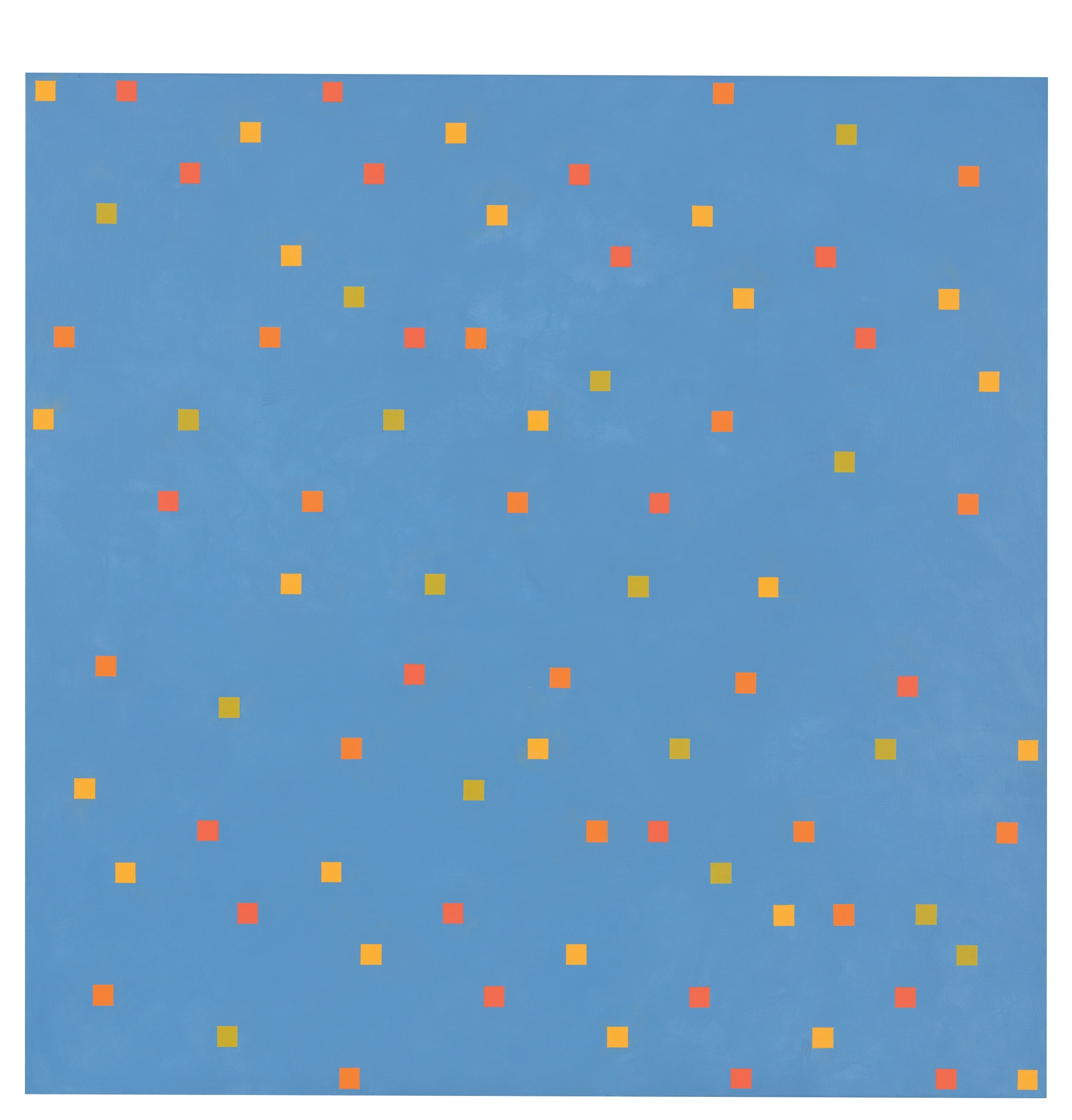
Having traversed her own Silk Road, Yoshikawa again entirely inverted the pictorial proportions in puls 1–13 (pulse 1–13) (2008–2011) and lebenspuls (pulse of life) (2011/2012–2013). While crosses composed of small blocks of color set in horizontal and vertical relation to each other had been a defining motif of her art since kosmische gewebe (cosmic webs), it now seemed as if all the cut-out colored segments and apertures she left between the blocks forming the crosses were re-arranged to take possession of the pictorial surfaces as snippets of color. In this spirit, circles and squares in miniaturized form were distributed rhythmically, first in smaller square canvases, then on larger rectangular canvases, sometimes rotated through forty-five degrees.
These forms, which seem pulsing with vitality, clustering together and combining, loosely grouped and full of buoyant energy, drive any thought of mathematical formulae or geometric construction from our mind. Yet they are nonetheless constructed. Distributed both regularly and unregularly, they unfurl across blueish and grayish supports. Towards the end of the series lebenspuls 1–28 (pulse of life 1–28) (2011/2012–2013), now deploying much larger formats, at times over 1.5 meters wide or high, Yoshikawa introduced a horizontal division into a white and gray triangle in square canvases set tilted to sit on the tip of a right-angled corner. Over this pictorial equator she positioned rhythmic color series of small, undivided squares, likewise positioned at a forty-five-degree angle. Each step of the tripartite linear configuration is made up of five units in yellow, red, blue and green, either comprising blocks of the same color or varying the color sequencing from one pictorial level to the next. In further variations she also experimented with vertical versions of this pictorial division, with its suggestion of musical notes, as well as trying out circular forms.
The pixel forms making up the image, which in earlier works seemed to be taking flight, are now collected into the configuration once again and depicted on a larger scale in the form of scattered dots on a uniform surface They swell to form smaller and medium-sized brightly colored circles. As a function of the color distribution and orientation, Yoshikawa creates a twisting motion through radically simplified configuration of the elements. Whereas previously her focus was on squares, right or acute angles, in this period her experimentation led the artist to combine two triangles with identical geometry but in different colors, conjoined along a horizontal central axis to form a square, positioned diagonally. It is just a small step from a white, rotating plane to brightly hued circles that increase in size towards the center of the image on a yellow or violet ground, also hinting in the title drehen zu zweit (rotating in tandem) at yin and yang-like connectedness. Back in 1993, Yoshikawa had written of her images: “In Chinese nature philosophy, ‘yin and yang’ […] are not opposing poles but signify a cycle and a complementary whole, in which time and space interact.”
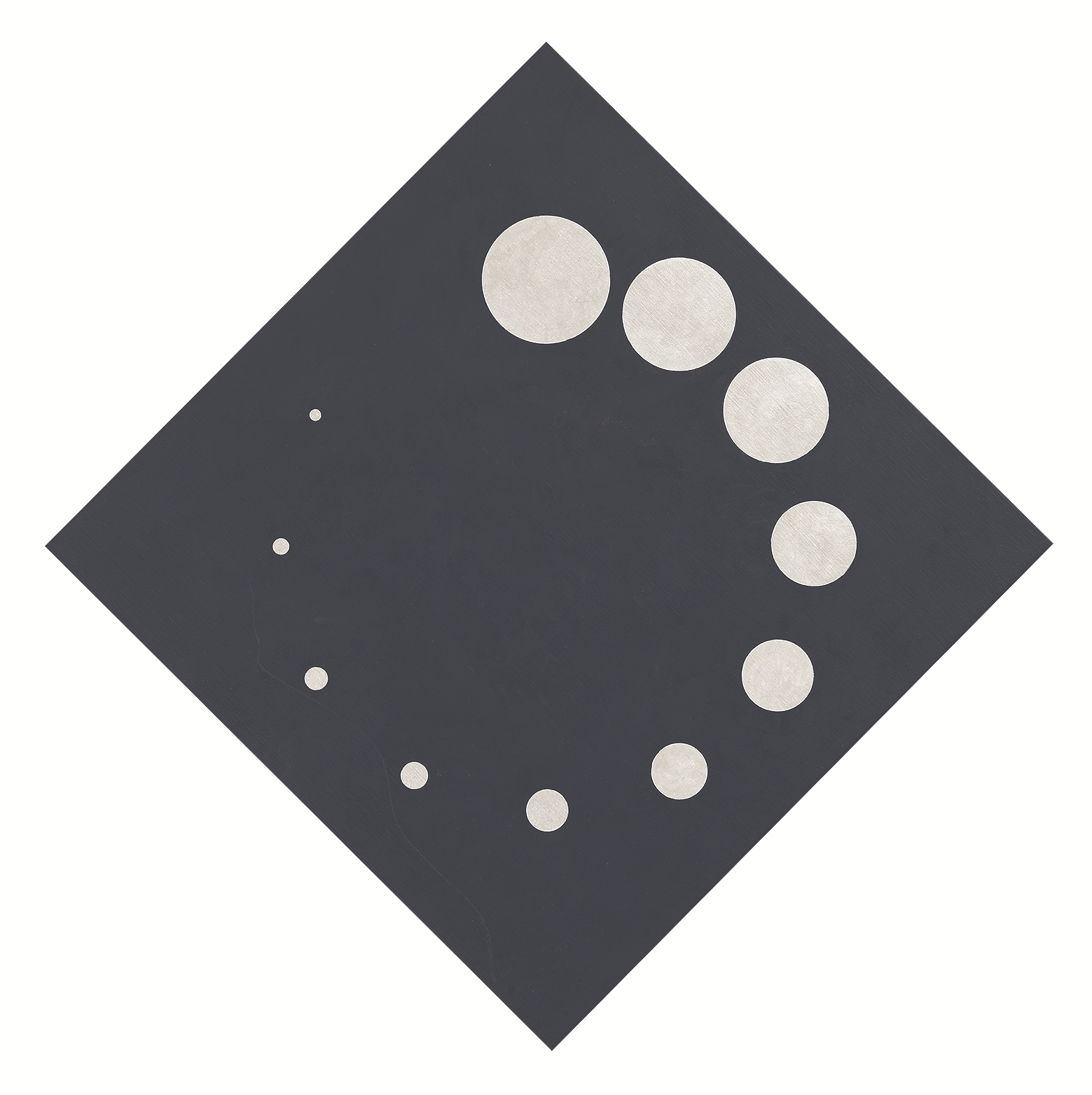
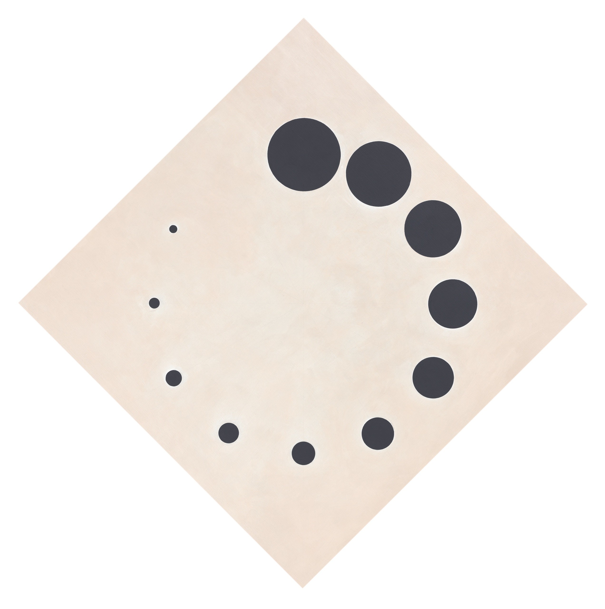
Spring 2017 saw Shizuko Yoshikawa concluding, with her typical considered clarity, that she had, on her own terms, achieved the complementary whole she had always pursued. She withdrew from painting into calm contemplation – yet not without creating a striking finale to her meticulous investigations of color and form. Once again, the formal and pared-down consistency of her pictorial creation seems as surprising as it is logical: m843 ohne titel (m843 untitled) (2016/2017) is a generously dimensioned square tilted through forty-five degrees. A circle, made up black circles that grow smaller in a clockwise configuration around the form, is set upon the white ground. A sense of waxing and waning is legible in this personal variant of yin-and-yang symbolism, along with the perfection of the elementary circular form.
(GS)

SY, m842 ohne titel (m842 untitled), 2016/2017, tempera and mother-of-pearl acrylic paint on canvas, 50 × 50 cm SY, m843 ohne titel (m843 untitled), 2016/2017, tempera and mother-of-pearl acrylic paint on canvas, 100 × 100 cm